A note before this one: it's a preview, not a review. Everything below comes from time with Veil of Madness's early demo build — an unfinished, unbalanced snapshot by the developers' own framing, not the finished game. Treat it accordingly.
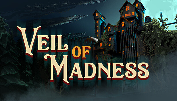
Madness, All Over a Manor
Manors have always been an easy source of dread — kenophobia, the fear of empty space, is the same instinct that made "the backrooms" catch on, and an old house full of vacant rooms taps straight into it. Veil of Madness stacks a second kind of fear on top: eldritch horror, with Cthulhu as its obvious reference point. But the label is a bit of a misdirect — mechanically, this isn't a horror game at all. It's a dungeon-crawler card game wearing a Lovecraftian manor as its skin, a combination that could genuinely work, or could just as easily collapse under its own concept. That's exactly the kind of thing a preview is for.
Madness, All Over the Gameplay
The manor shows up immediately, rendered as a 2D backdrop behind a fairly standard main menu — start, continue, new game, the usual list. One odd choice stands out early: the cursor is a small "plus" sign, easy to lose track of on first glance at the screen.
Character selection is where the demo's first real problem shows up. Each character carries different starting resources and trade-offs — more gold here, less health there, different cards available — but none of it is explained anywhere before you're asked to pick. Even having already played the build, it's genuinely hard to reason about what a given character actually does differently, since the effects are never surfaced. Given how much these choices shape the run that follows, that's not a minor omission.
Once a character is locked in, a tutorial screen walks through movement, the turn system, the compass, the minimap, and attack/defense points — useful, but dense enough that it risks losing exactly the casual, shorter-attention-span players the genre increasingly needs to court. The UI has its own small idiosyncrasies worth flagging: the health bar uses purple rather than the red most players expect by convention, and resources are split across the screen — health and defense in the bottom right, attack points and the "end turn" button somewhere else entirely. That separation might be intended to keep turn state and character capability visually distinct, but in practice it just means tracking two separate areas of the screen instead of one, when consolidating them would likely read faster.
Combat itself is a familiar turn-based card structure: player and enemies alternate, and on your turn you play cards up to your Attack Points (AP) limit — a fairly standard resource constraint for the genre, and a reasonable one. The cards and their AP costs clearly still need balancing pass — reasonable to expect at this stage, given the developers are explicit that this is an early demo. Visually, the environmental art holds up well: full 3D modeling with deliberately eerie textures for both the manor and its enemies, with enemy models specifically downsampled to a chunky, pixelated look — an intentional-feeling choice that adds to the "something not quite right" atmosphere rather than undercutting it.
Closing Thought
Veil of Madness is an interesting pitch — dungeon-crawler card mechanics wrapped in a Lovecraftian setting — currently sitting at a genuinely early demo stage, with the rough edges that implies. The character system needs a tutorial pass, the UI needs consolidating, and the cards need real balance work. None of that is disqualifying at this stage; it's what a demo is supposed to surface. The core idea has real potential if the next few passes of development are handled carefully.